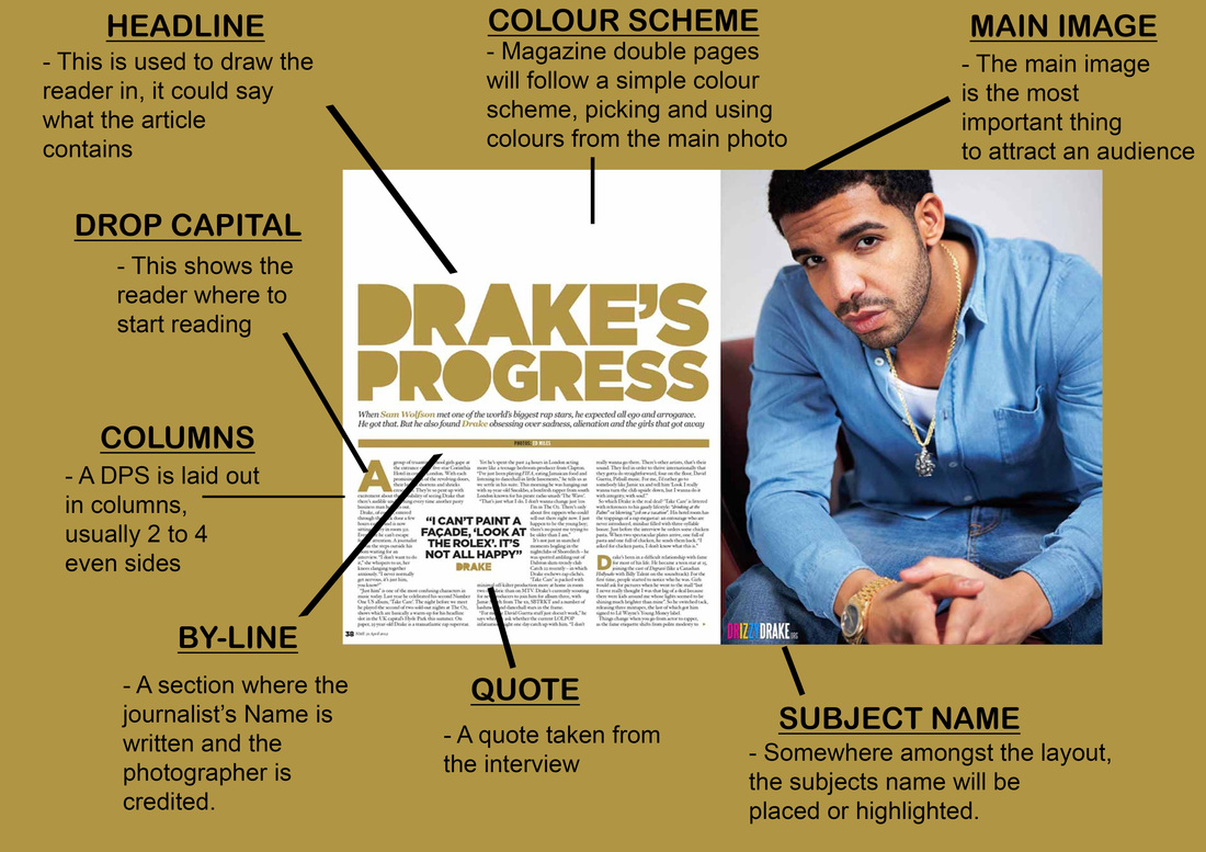
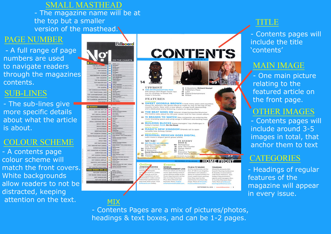
TEXTUAL ANALYSES
In this stage I had to analyse different magazines pages, I had to explain all the denotation and analyse the MISE-EN-SCENE on the page.
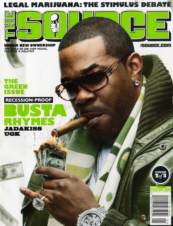
DENOTATION This magazine has the hip-hop artist Busta Rhymes lighting a cigar as the cover. The front cover consists of a green, white and black theme. The background of the cover is light grey, this allows the text on the cover to stand out. The artist is clothed in green which also matches the theme of the magazine cover. MISE-EN-SCENE Setting: The background of the cover was created using a plain backdrop in a studio. This is what people use during photo shoots and this can allow the theme colours to stand out. Props and Costume: There are numerous props used to create this image on the cover. The artist Busta Rhymes is wearing a green jacket and scarf. This allows the magazine editors to create the cover in a way where it will stand out. Busta rhymes is also wearing a watch, ring, ear ring and a chain. This implies that he is a very prosperous person and this is shown on the cover of the magazine. This is also shown in the cover, for example Busta Rhymes is lighting a cigar from burning money. |
|
Lighting: The lighting is created using studio lights on the cover to stand out green, white and black theme. The lighting helps create an impeccable picture used in the cover.
NVC: Busta Rhymes is not looking at the camera which connotes that he is too focus on something else and that he is a very demanding person. His facial expressions also connotes that he is composed and chilled.
TYPOGRAPHY
Masthead: The title of the magazine ‘The Source’ is in a bold green colour so that it can stand out and be vibrant. The green colour also allow the word to be read easily without any anxiety.
Cover lines: The main cover line says ‘recession-proof’. It has a black border/background because it allows the sub-heading to stand out on the cover. The purpose of the black writing is as for the black writing contrasts with the white writing
Colours: The main colour scheme of the front colour is green, black and white. The green colour is used predominantly. This allows the audience to be captivated by the colours. This appears enriched because the background is dark grey.
TARGET AUDIENCE
The target audience is for any teenager who is interested into R&B/Hip-Hop
|
DENOTATION
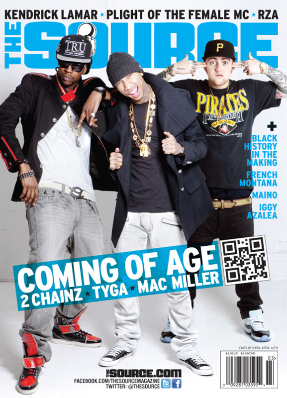
This magazine front cover has 3 artist who are featuring in this issue, 2 Chainz, Tyga and Mac Miller. The background is a white/dark grey colour, this suggests that this picture was taken during a photo shoot in a studio. The snapshot is a medium shoot of the 3 artist. The theme of the front cover is blue, white and black. MISE-EN-SCENE Setting: The background is a clear white/dark grey colour this was created by using backdrops in a studio. The plain background allows the pulsating colours to be prominent. Props and Costume: The artist are all wearing their own different clothes. Sometimes clothes can connote to somebodies personality. Tyga is wearing a gold chain around his neck which connotes to wealth. Mac Miller is wearing a short sleeve T-shirt that exposes his tattoos. That can connote to someone who is rebellious and ruthless. NVC: The artist are all posing in different actions. Tyga looks like he’s showing of his chains to boast about him being prosperous. |
|
TYPOGRAPHY
Masthead: The main title is a light blue colour, it appears well because the background is white. The font of the title is sent to the back which means the picture is in front of the text which give a neat effect on the cover.
Cover lines: The cover lines are either blue or white. The reason being is because both of the two colours compliment each other. The fonts are all the same but the words are different sizes
Colours: The clear colour scheme of this magazine cover is blue, white and black. The blue and white colours make the cover more eye-catching.
TARGET AUDIENCE
This magazine is for people who are interested in R&B/Hip-Hop.
|
DENOTATION
In this double page you can see the artist The Game. He’s sitting on a bench which seems to be in his local area. In the background there is a wall which is covered in graffiti. People who see this will assume that he grew up in the area and he knows it really well. The picture takes up more than half of the page and on the other side there is an article. MISE-EN-SCENE Setting: The setting in this image looks like it is set in a park or a local area that holds a special place in The Game’s heart. It looks like a nostalgic place to him. There is a lot of graffiti on the building behind him which creates an image of rebellion. |
|
Props and Costume: The Game is wearing a hat and chains around his neck. He’s also wearing a short sleeve t-shirt which reveals the tattoos on his arm. The watch on his arm looks expensive which means that he is wealthy.
NVC: The Game is not looking at the camera but is looking at the distance. This is often used in hip-hop music as it makes them appear relaxed and casual.
TYPOGRAPHY
Masthead: The main headline of the magazine is gold. The colour gold is the colour of success, achievement and triumph. Associated with abundance and prosperity, luxury and quality. It is in a very bold font which create a virtuous effect on the page.
Cover lines: The cover lines are all black which works really well in this case because the word are presented well on the white background.
Colour Scheme: The clear colour scheme of this double page is gold, white and black
TARGET AUDIENCE
The target audience is for anybody who is interested into R&B/Hip-Hop

|
DENOTATION
In this double page you can see the artist Rick Ross. He is dressed in a suit and holding a glass and a bottle of champagne. There are balloons behind him, this suggest that he is having a celebration for something. MISE-EN-SCENE Setting: The setting of this double page looks like he is holding a party. The balloons in the scenery also seems that there is a special occasion. The whole picture would have been made during a photo shoot. Props and costume: Rick Ross appears to be wearing a black tuxedo which a white shirt underneath. He’s also holding a bottle of champagne in one hand and a glass in the other he is also wearing black sunglasses. NVC: Rick Ross’s body language could tell the audience that he is a very popular person and that he’s very rich. |
TYPOGRAPHY
Masthead: The headline is black and bold. This makes the headline stand out and catch the eye of the readers. It also has an attention-grabbing effect on the writing where the word are flipped. This is a unique technique that the editors have used.
Cover lines: The cover lines are also black but smaller than the main headline which is much larger
Colour Scheme: The main colours of this double page is black and white. White is associated with light, goodness, innocence and purity whilst black is associated with power, elegance, formality, death, evil, and mystery.
TARGET AUDIENCE
The target audience is for anybody who is interested into R&B/Hip-Hop
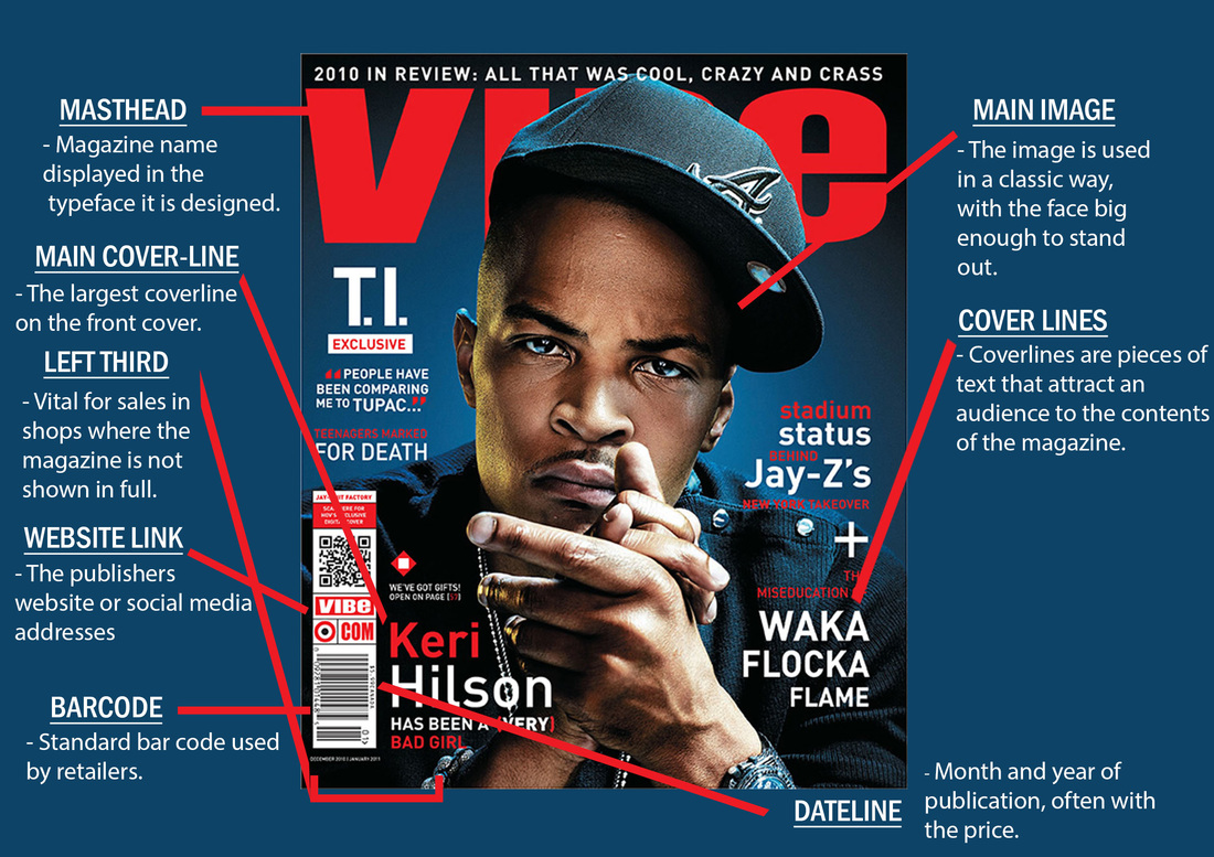
CONVENTION DIAGRAMS
This task was all about learning the different conventions on the magazine pages.
AUDIENCE PROFILING
|
General Information
Name: Ramon Hayden Age: 17 Occupation: College Student Ethnicity: Black British/Caribbean Likes: Grime Music, Football, Hanging out with friends, going to parties, dancing, going to the gym, sleeping Dislikes: Being told what to do, ignorant people |

|
|
Hobbies and Interest
Ramon likes to listen to a lot of music his favourite genre is grime. He finds it very relaxing to sleep while listening to music. Friends and Family are a massive part of Ramon's life, he spends most of his free time with his friends or family. Whether it's going out to the cinema with friends or texting them on the phone. Ramon loves going to parties or raves occasionally on a Saturday night. Clothing and Fashion Ramon is a very fussy person when it comes to the way he dresses. He specifically like to wear tracksuits whether it is Nike, Adidas or Puma but he wouldn't wear tracksuits if it is not from one of these brands. He also like having the latest trainers from JD. He would save up his money every week to buy a new pair of trainers once a month. Music Interests He enjoys listening to any type of music but his favourite is grime. Music means the world to Ramon, anywhere he goes he'll have his earphone plugged in and he would be listening to music. His favourite artist are Wiley, Kano and Ghetts. He even has wallpapers on his bedroom of these 3 artists on his wall. Ramon even inspires to be a grime artist one day, he makes his own song on his Mac at home. |


Hobbies and Interest
Ivy likes to go shopping a lot. I'm talking at least 4 times a week she'll go to the shopping centre with her friends to buy a new outfit, new shoes and even new makeup. She also like decorating her room often. She would usually add new wallpapers to her bedroom wall of her favourite musicians or change the layout of her room when she's bored of it. Ivy is an animal lover. She owns two dogs, 1 rabbit and a bunch of fish in her own tank. Ivy works on weekends to earn more money so she can buy new things. If the weather is not great, you'll find Ivy locked up in the cinema room watching 5 episodes straight of her favourite show. Clothing and Fashion Ivy who follows a trendy fashion style is always up-to-date on the latest trends, and probably refreshes her wardrobe four times a year with the changing seasons. She always makes sure she’s following the latest fashion news and always looks like she just stepped off the runway. She would wear some popular sport companies like Adidas or Nike and will always have runner shoes on. Music Interests Ivy loves to listen to music, she would usually play music out of her speakers in her room while relaxing. She listens to all genres but her favourite genre is of course Grime. She grew up in South East London which meant the grime was really very popular at that time. All her friends at school also listen to grime so she could literally her it everywhere. Her favourite grime artist are Mz Brattz, M.I.A and Lady Sovereign. |
General Information
Name: Ivy Brooks Age: 18 Occupation: University Student Ethnicity: Black African Likes: Going to the cinema, watching Netflix, makeup, puppies, cute babies and of course shopping. Dislikes: Anything to do which sports, being bored and bad WiFi
|


AUDIENCE RESEARCH
I had to conduct some audience research which I collected by making a survey and having the target audience of my future magazine, answer it. I asked 20 questions in total 10 for my Cover page, 5 for my contents page and 5 for my double page. We used various different social media sites to conduct this questionnaire. So I decided to use Twitter, WhatsApp and Email. I would then have to use the information that I collected, to create my magazine. People have different views and opinions so the option with the most votes would be the one that I would consider to use for my final product.
My 20 questions were...
Front Cover
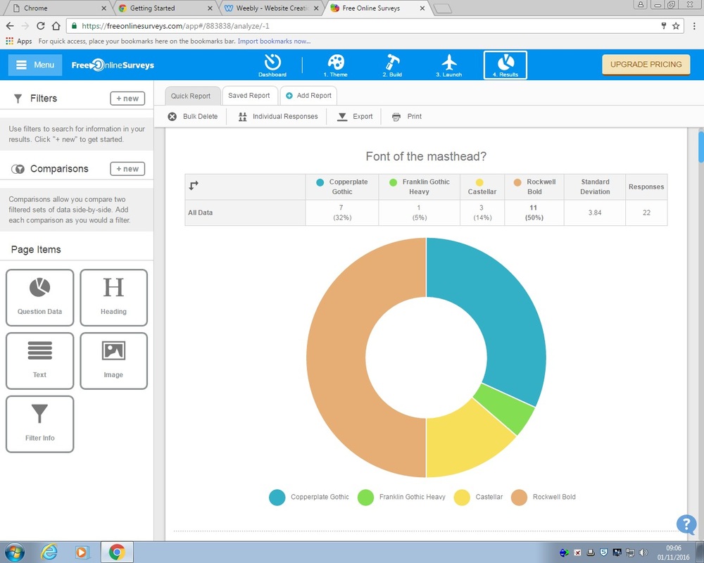
- Font of the masthead?
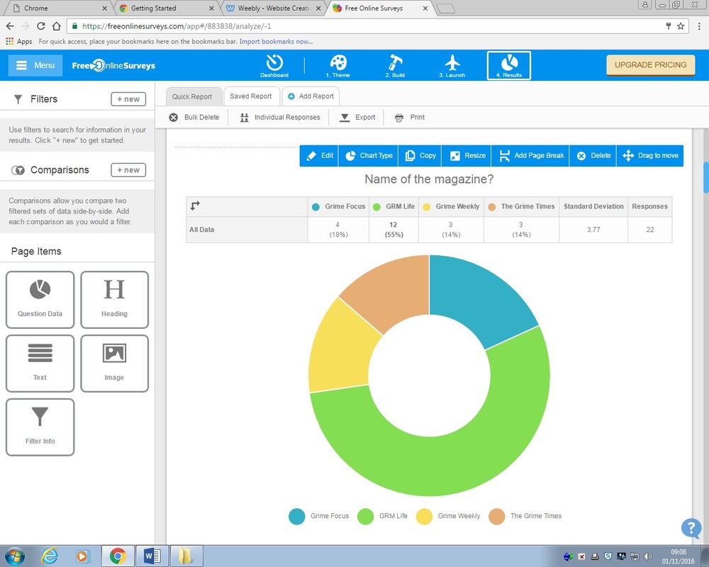
- Name of the magazine?
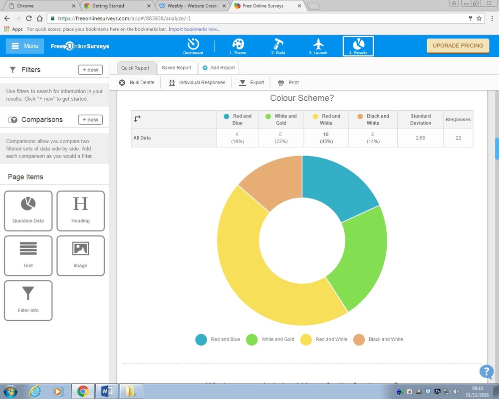
- Colour Scheme?
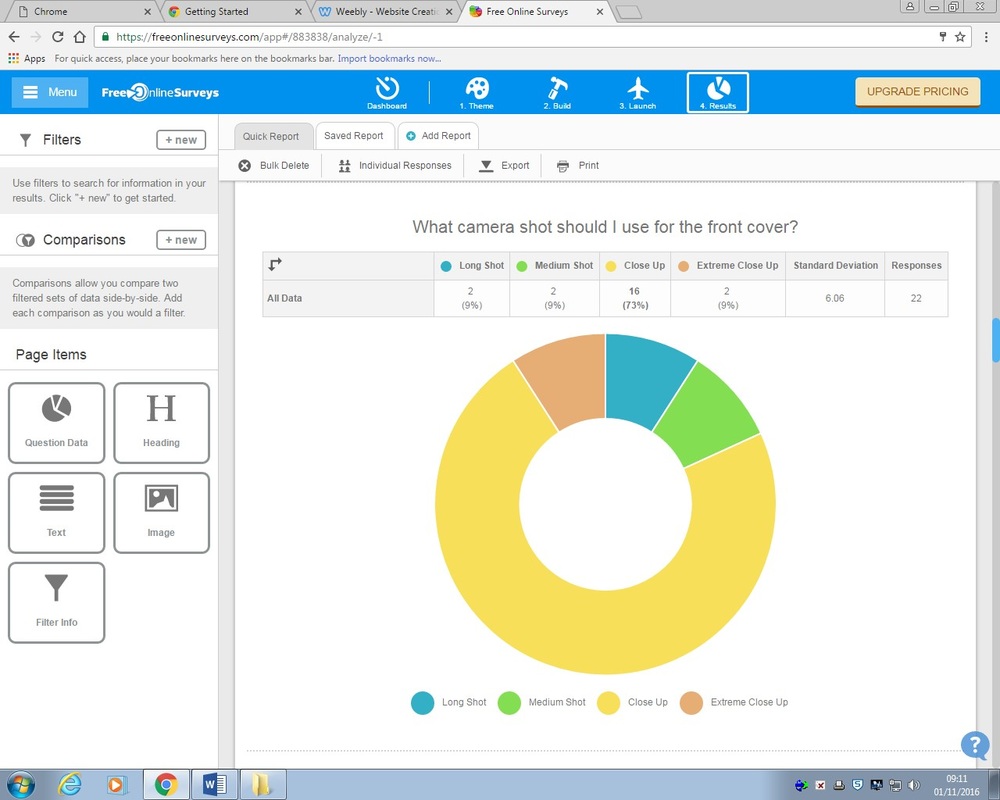
- What camera shot should I use for the front cover?
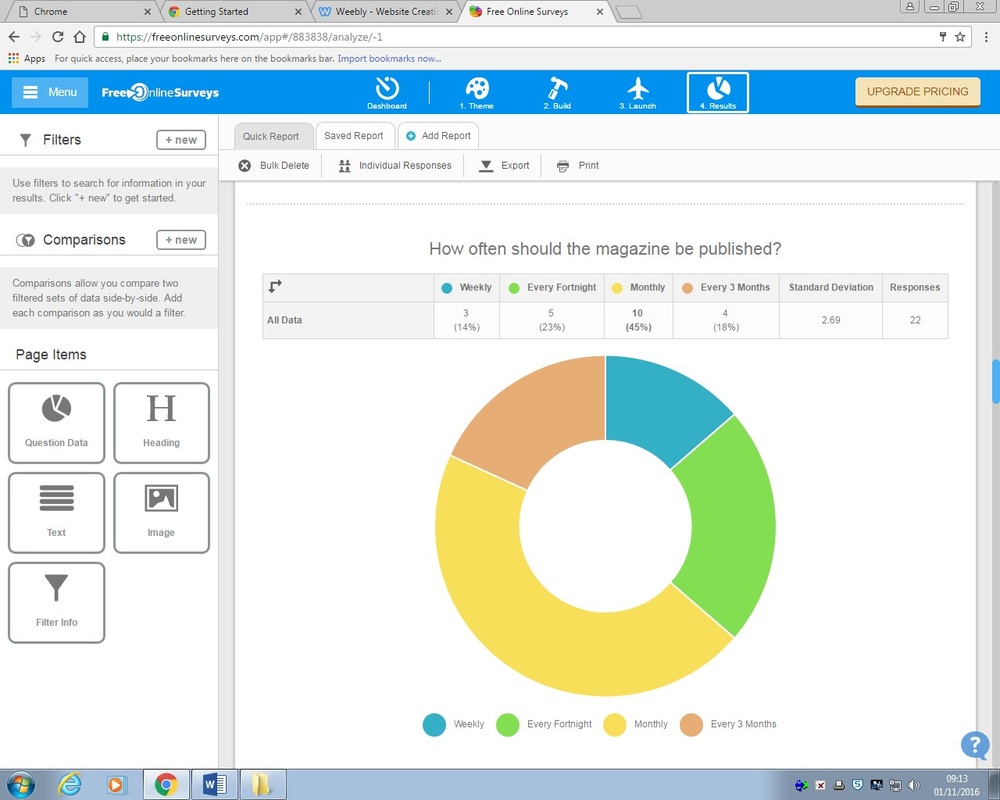
- How often should the magazine be published?
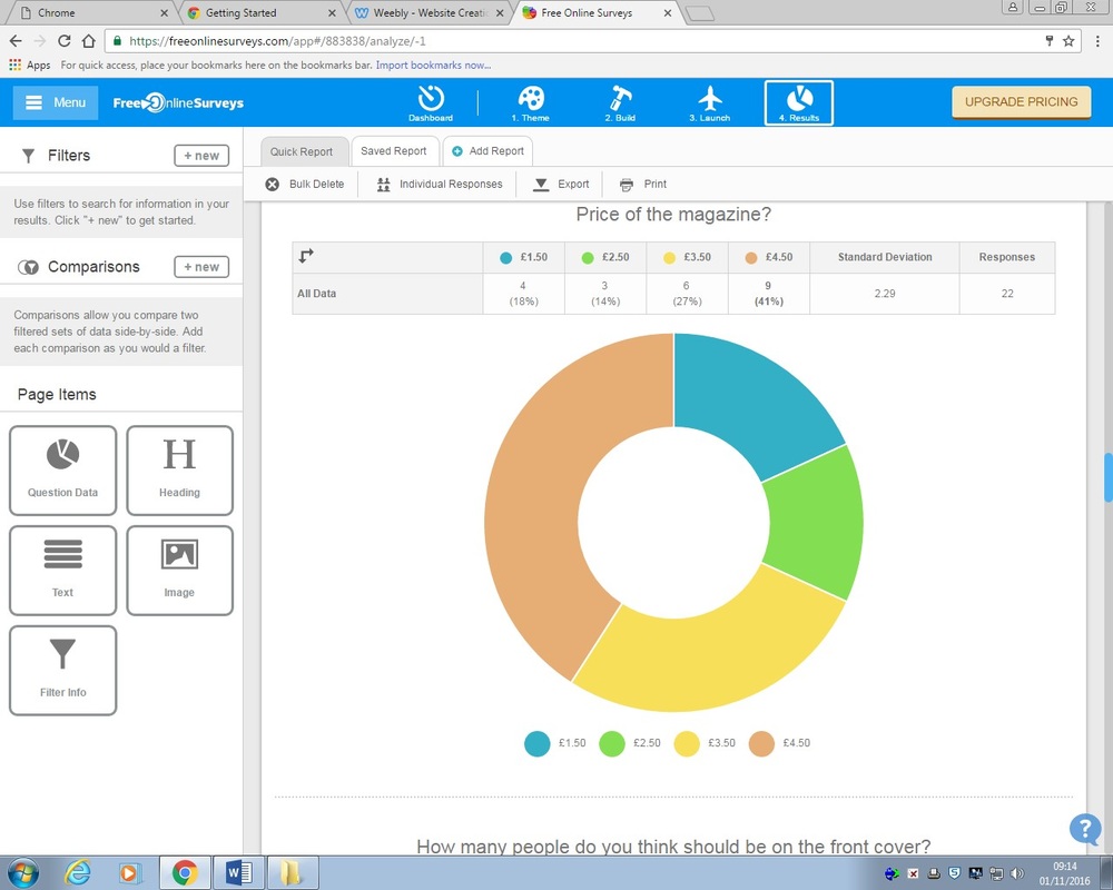
- Price of the magazine?
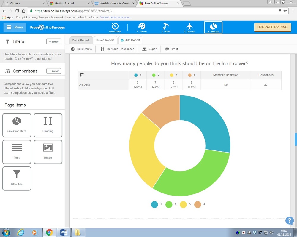
- How many people do you think should be on the front cover?
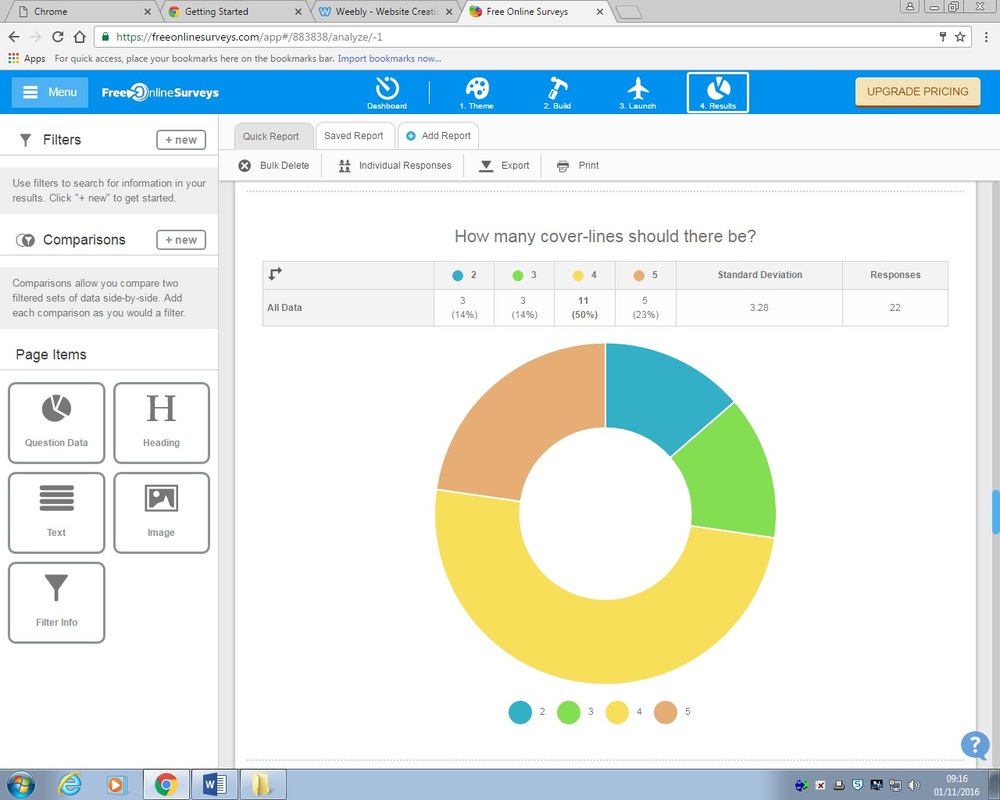
- How many cover-lines should there be?
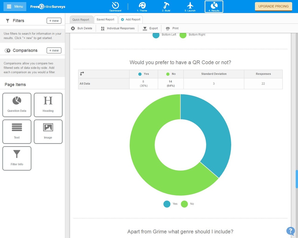
- Would you prefer to have a QR Code or not?
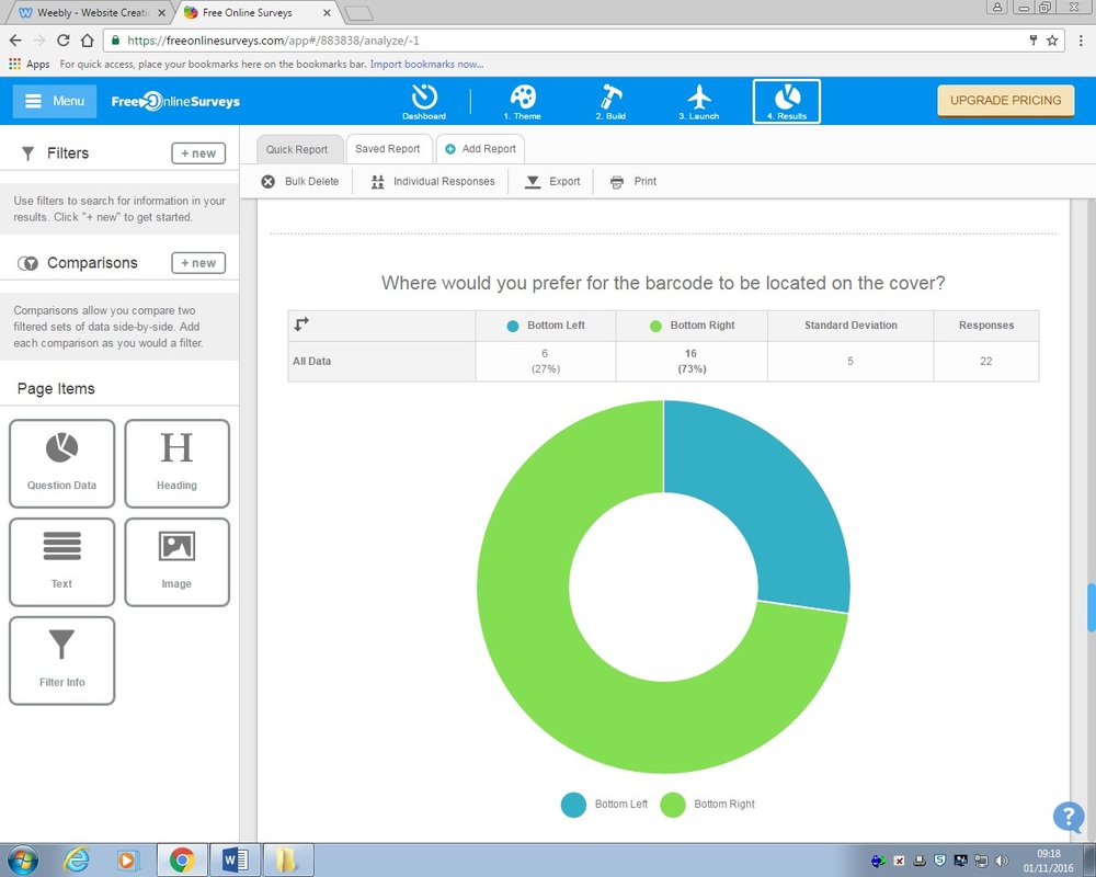
- Where would you prefer for the bar code to be located?
Contents Page
- Layout of my contents page?
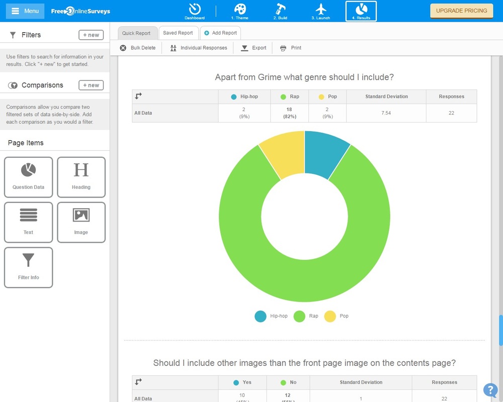
- Apart from Grime what genre should I include?
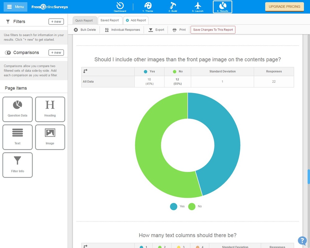
- Should I include other images than the front page image on the contents page?
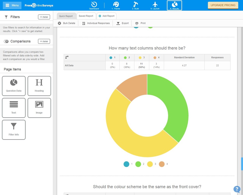
- How many text columns should there be?
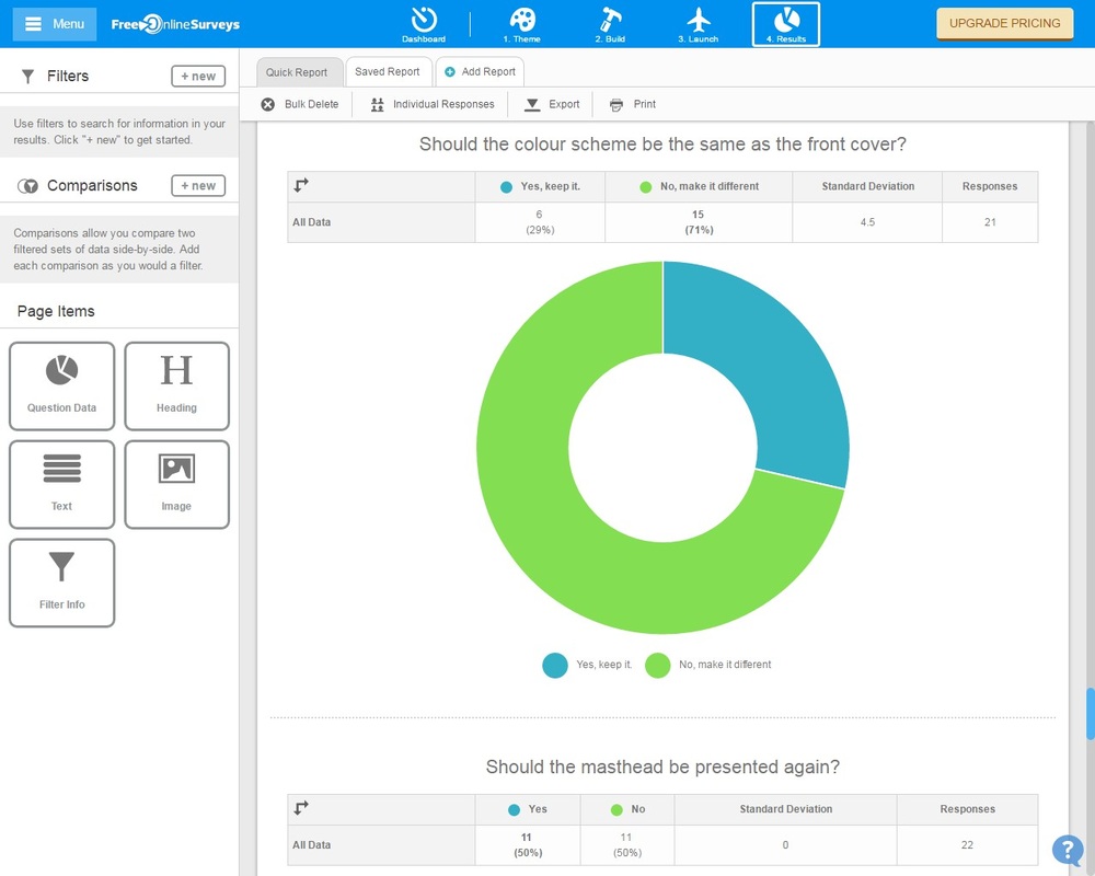
- Should the colour scheme be the same as the front cover?
Double Page
- Layout of double page?
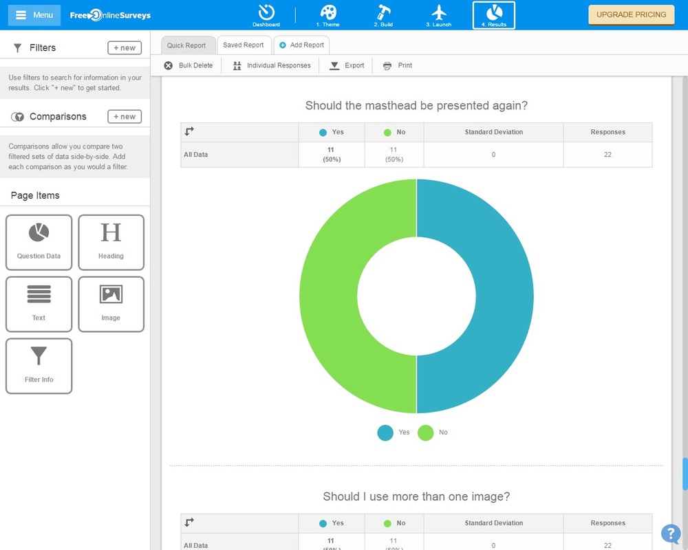
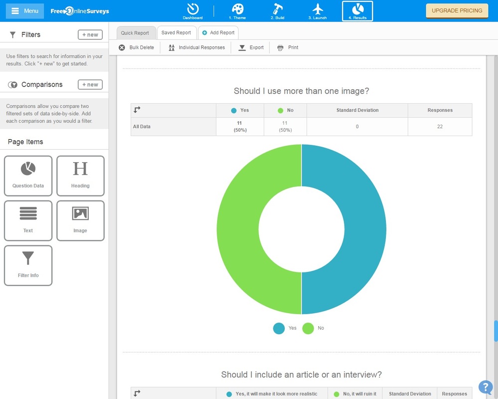
- Should I use more than one image?
- What should the double page spread consist of?
- How should the text be laid out?
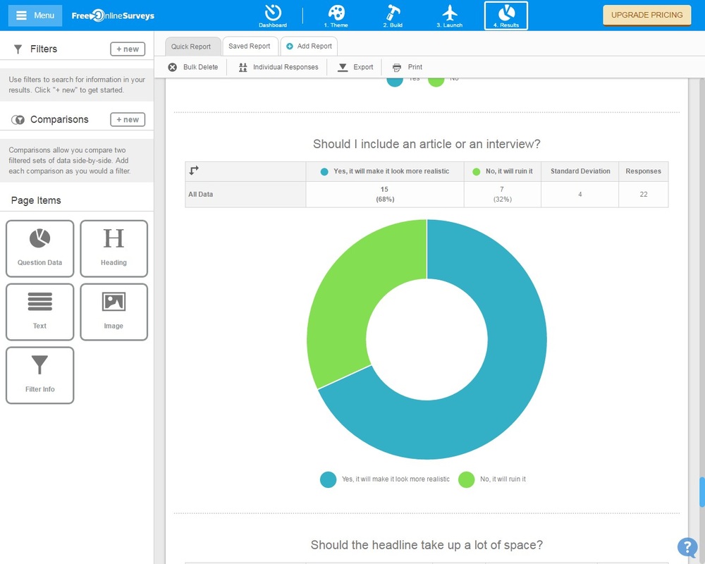
- Should I include an article or an interview?
QUESTIONNAIRE RESULTS
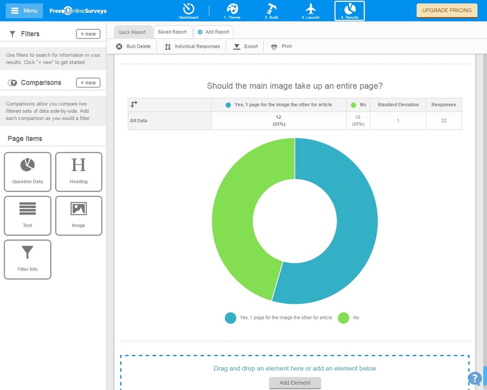
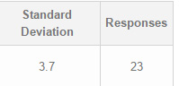
Here are the results of my questionnaire. I asked a total of 23 people to take part in my survey. I also tried to asked the same amount of people from each gender to try and make the results as fair as possible. I made sure that the people I asked were a part of my target audience as I would alter and create my magazine to match their interests.
Front Cover
|
|
|
Contents Page
|
|
|
|
|
Double Page
|
|
|

|
|
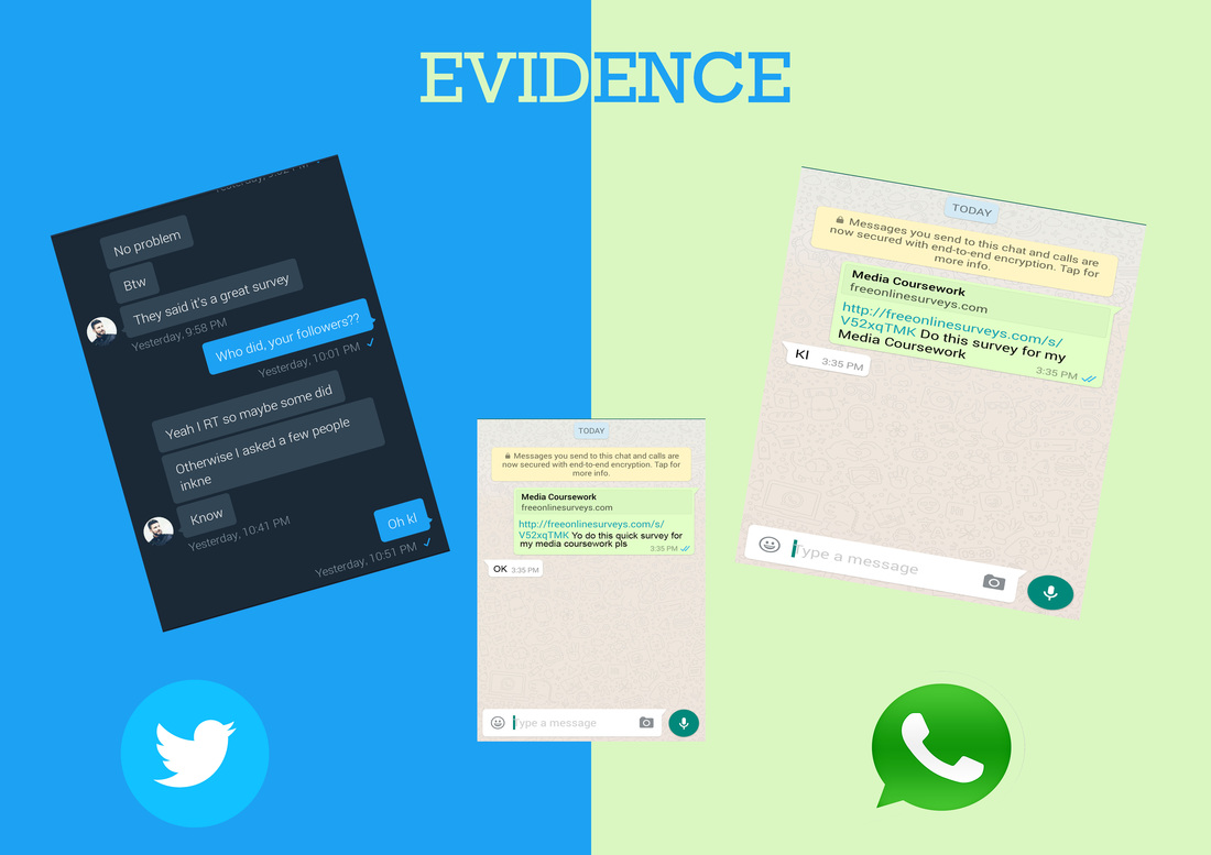
EVIDENCE
I asked people to fill in my questionnaire through. Various social media sites such as Whatsapp, Twitter and Snapchat. I also used my email to send people the link of my questionnaire.
|

|
EVALUATION
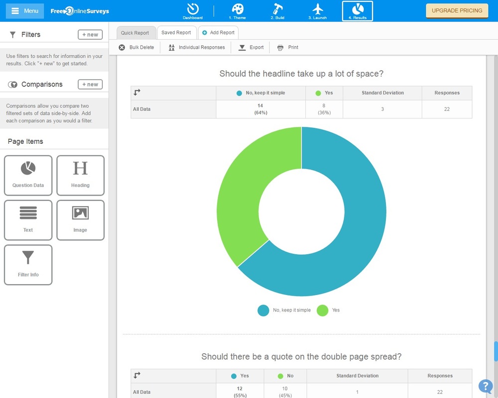
I have gather all the information from the results of my questionnaire and have come to the following conclusions. My magazine will be called GRM Life, it received a total of 55% of the total votes. The colour scheme that I will use is a red and white theme. The target audience will be between 16-23 year old. The chosen font of the masthead will be 'Rockwell Bold' because it was the most popular choice. The main image of the cover page will be a close up of 2 people as it had the most votes. My magazine will be published monthly at the price of £4.50 as it was a popular request. I will use a variation of 4 cover lines on my front cover using titles that would attract a bigger audience. I will have a bar code on the cover which will be located on the bottom right. My magazine will focus on Grime but I decided to include a little bit of another genre to my website. I in my questionnaire I gave the people and option to choose between Hip-Hop, Rap and Pop. The outcome was that I include rap to my magazine so now I will. Text columns will also be included to my website and I will use 3 of those. A lot people wanted me to use a different colour scheme that I used on the front cover. So I will use a white and gold theme as it received the 2nd most votes. Question 15 was close, some people wanted the masthead to be presented again, some didn't but more 1 more person didn't. So I came to a conclusion that I will not show to masthead again on the contents page. People agreed that I should use a article. Question 16 was a split 50/50, some people wanted more than 1 image on the double page. I decided that I will use more than one image.
